Oxford University press published its first book in 1478, a commentary on the Apostles Creed. This is the Oxford “Arms” as they appear on the title page of that book. Through the centuries, branding for the press centered on the Seal of Saint Augustine—3 crowns and a book.
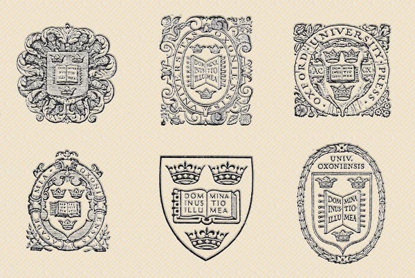
Style varied widely since the Press’s imprints were printed from hand cut wood or lead carvings. When they wore out, they were recut, again by hand. Several thousand variations appear in the archives of the press. The Quincentenary brand mark was the first to reflect the modernist aesthetic.
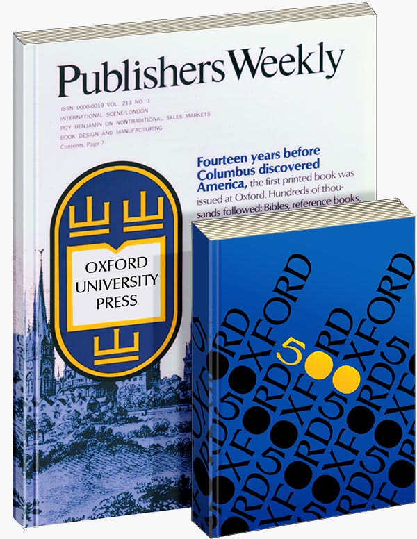
Oxford’s anniversary was supported by internal and external publicity. Publisher’s Weekly carried articles about the history. Internally, all advance copies sent to reviewers in the Quincentenary year were wrapped in special jacket using a repeat pattern celebrating “Publishers of fine books for five centuries”
OXFORD UNIVERSITY PRESS 500th anniversary celebration. For the “Quincentenary” David Laufer produced a brand standards manual, anniversary logo, pattern, and typographic system. The quincentenary brand helped focus the media on this remarkable milestone; it appeared in more than 60 publications worldwide, including Time Magazine, the World Tribune, and Publisher’s Weekly.
Oxford University, founded possibly as early as 1096CE, was chartered in 1248CE, making it most likely the second oldest continuously operating institution of higher learning (University of Bologna was chartered in 1158.) More about Oxford University Press History.
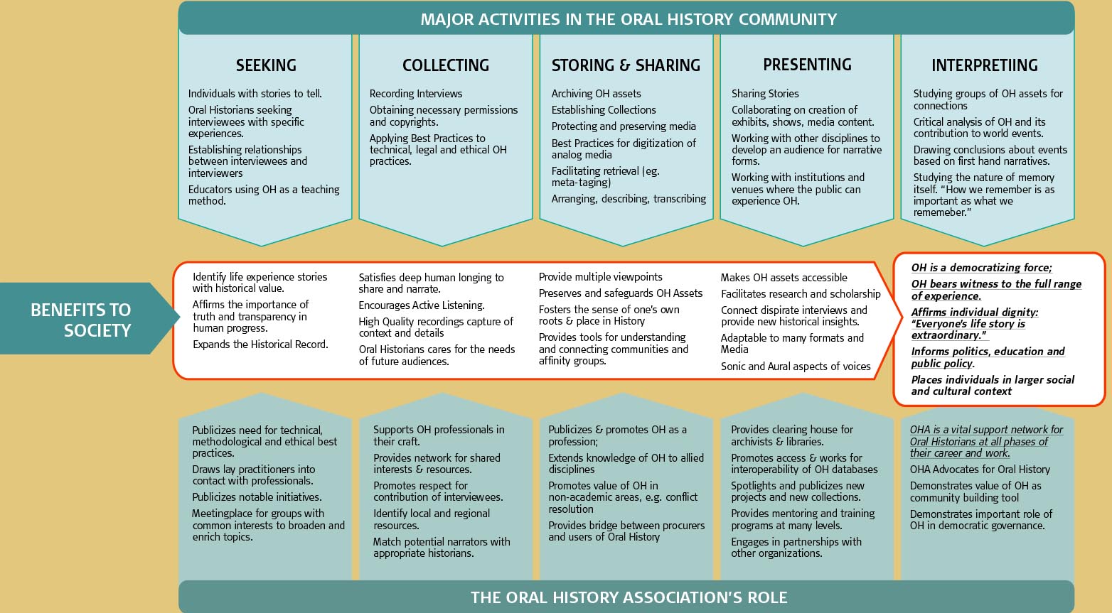
Rebranding is a special challenge; it involves getting to the very soul of the organization, and finding consensus among many stakeholders. Brandbook uses a variety of foundational tools to ensure a successful process. Above is a matrix developed to study the work of Oral Historians and foster discussion about what makes the organization. The crucial task is to discover both the internal value—what members derive from their affiliation, and external value—how society benefits from the work historians do. This process clarified what the new branding message needed to be.
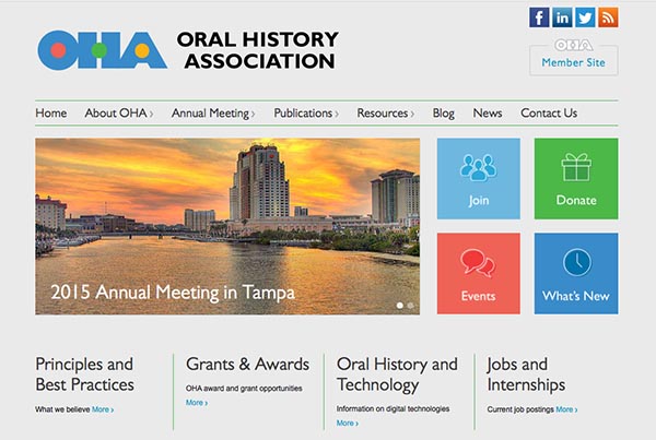
The OHA website is an almost daily habit for many Oral Historians; the best practices, technical information, and community events bring considerable traffic. Clear branding and frictionless navigation were essential to making the site a success.
OHA’s quarterly review is another important touchpoint; something members have enjoyed for decades. Keeping the traditional blue cover became a way to hang on to a familiar element of the past while modernizing other touchpoints.
ORAL HISTORY ASSOCIATION Strategic Rebranding.
The Oral History Association is a learned society; its members are historians and professors of history. Oral historians collect interviews with people who share their life histories via audio and video recordings. Founded in 1965, OHA undertook a strategic review in its 49th year. Technological change, demographic change, and generational attitudes about history all required a new vision for the organization. Brandbook worked with OHA’s board of advisors and staff to build consensus about the organization’s future, understand its benefits to society, and most of all understand what OHA members needed from their professional society.
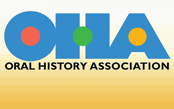
The predominant momentum within the OH community is one of conviction that their work is exciting, vital, and colorful. The work of Oral Historians matters because it gives voice to many amazing lives that otherwise might not make it into the historical record. Thus a bold, colorful, brand mark won the overwhelming majority of delegates who participated in the rebranding process.